


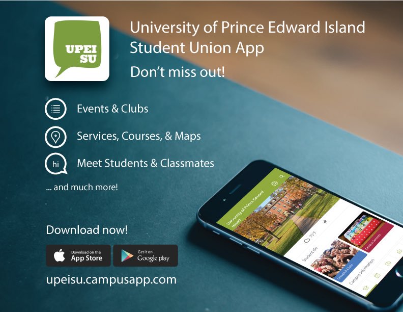
It’s very refreshing to have many systems that enhance daily student experiences here at UPEI. With utilities such as Onesearch, Moodle, and MyUPEI, we are well equipped with services for having great success during any given semester. The black sheep in all this would have to be the UPEISU app. Available on IOS and Android, the app is less than optimal compared to the other services available. The app that has been out since 2016 feels like it is from 2008, therefore, some hands-on work to improve its functionality and purpose should be discussed.
The app was created by OOHLALA Mobile, the company that creates most of the university apps across Canada. They advertise different features that would seem very promising for a university student. The app comes with a class manager, study tools, timetable sharing, events, tours, deals, campus services, groups and clubs, campus feed, campus map, and a student list. What a deal it seems! It’s not like anyone of those things are well done or better than any other product on the market.
First off, four of the features offered do not even exist. I could not find anything on study tools, timetable sharing, tours, or deals. The features that are there have a few problems. Most of the classes that were on my timetable were not listed and the search bar was not efficient. Events, which many students look forward to the most, are not as frequently updated as you would expect. The campus services option brings you back to the original websites, making another gap in the process that should not be there.
Groups and Clubs are interesting for the most part. The UPEI SU app gives a blurb about the group, outlines the purpose, the location, and meeting times. For the most part, however, they are blank and only give out the contact information of one of the members.
The only service that I liked was the campus map because as a first-year student, I couldn’t tell one building from another. The SU can brag about a bunch of things, but being a jack of all trades and a master of none, does not provide an excellent platform for students.
The app has been revised five times in its lifecycle. After every revision, the app does not detail the changes made to the product. Instead, it just states that the overall experience has been improved. I found that this version was the worst out of the bunch. Scrolling to find anything in the app feels sluggish and takes a million years. The developer has also asked that there be feedback sent through the function in the app. When looking at the reviews on the App Store, the app won’t display them. There has been such a lack of effective communication between students and the app developers.Â
With features that feel half-baked, the app almost seems counterintuitive. Why should students use the calendar if they can use the one on their phones already? Why use the timetable when they already know their schedule and have it planned out? Why post on the wall when everyone just wants to sell textbooks? The SU needs to have a solid product that its members would desire to use. The app is an attempt at improving student experience and for that it deserves praise. On the other hand, there is much to be desired of it. That needs to change.
By: Iain Burhoe